Step 1
Create a 600 by 500px, RGB document with the units set to pixels. Take the Rectangle Tool (M) and Option + Click onto the artboard and create a 400px by 100px Rectangle.
Step 2
Make the side parts of the banner using the Rectangle Tool (M). Option + Click onto the artboard and create a 150px by 100px Rectangle.
Step 3
Take the Pen Tool (P) and add an anchor point to the middle of the right side of the rectangle. With the Direct Selection Tool (A) move the point to create a V shape that will make up the end of the ribbon.
Select the ribbon end and make a reflected copy by Option + Clicking onto the middle of the main rectangle with the Reflect Tool (O) and make a Vertical Copy. Select both ribbon ends and move them to the back of the image (Select then Command + Shift + Left Square Bracket)
Step 4
In this step we will be making the pattern for the ribbon. This can be whatever you like. I’m creating a basic stripe, so I’ve made a small rectangle and then copied and pasted another rectangle into place (Command + C then Command + F) and reduced its scale. I’ve colored each rectangle a shade of Red with one rectangle lighter than the other. Select the shapes and drag them into the Swatches Panel to make a background.
Test the fill pattern on the ribbon to see if you like it. Once you’re happy it’s time to add some more details.
Step 5
Select the ribbon and click the Add New Stroke button, edit the settings so that the stroke has a Weight of 1pt and a Dashed Line with a dash of 4pt and a gap of 4pt and is light in color (I’ve used white).
With the stroke selected, go to the "fx" button in the Appearance panel and navigate to Path > Offset Path and enter an Offset of -3px.
Step 6
Select the fill of the ribbon and go to the "fx" button in the Appearance panel and navigate to Stylize > Inner Glow. Set the color to be a darker tone of the ribbons main color (in this case I’m using a dark red) and set the opacity to 50%, the Mode to Multiply and the blur to 15px.
Step 7
Now it’s time to add the text! I’m using a great font called Pacifico at scale of 48pt. Depending on the font and text you’re using you will have to set the point size to match the size of the ribbon. If you want to use the same font as I am, you can download it for free from
Font Squirrel.
With the text selected, go to the Appearance Panel and add a White fill, and then a fill in a dark shade of the ribbons main color (for this I’m using dark red). Make sure that the darker color is under the white layer. Select the darker color in the Appearance Panel (make sure the text is still selected or the effect won’t be applied) and go to the "fx" button and navigate to Distort & Transform > Transform. Move the layer -5px Vertical and click OK. This will make a shadow for the text.
Step 8
Your ribbon should look something like this. Now it’s time make it curvy. Select the text and the top part of the banner and group them together (Command + G) then select the two side parts of the ribbon and Group them together using the same technique. You should now have two groups that make up the ribbon.
Select both groups of the Ribbon with the Selection Tool (V) and go to the "fx" button in the Appearance panel and navigate to Warp > Arch. Set the Bend to 20% and click OK.You will now have a curvy banner.
Step 9
Select the Ellipse Tool (L) and Option + Click onto the artboard and create a 350px by 350px circle.
Select the circle and move it behind the top group of the ribbon with Command + Left Square Bracket. The circle should be nested between the top and bottom groups of the ribbon like you see in the image below.
Step 10
Select the circle and apply a radial gradient from a light tone to a slightly darker tone. I’ve used white to light blue for mine, you can use any color you like as long as it’s lighter than the ribbon (this helps the text stand out). In the Appearance Panel add a 1 or 2pt stroke in a slightly darker tone than the gradient to define the outside of the circle.
In the image below you will see how I’ve positioned the gradient. You can edit the gradient any time you like, simply select the circle then chose the Gradient Tool (G) to move and edit the gradient within the artwork.
Step 11
It wouldn’t be a sale without the eye-catching discount. I’ve added some text using the font "
Museo Slab 500" which is also a free font, you can download it from
FontSpring.com (you will need to register for an account).
Note: I’ve been pretty lazy here as I’m working to create the design without much effort, so to make the text balance, I’ve broken it into two lines and reduced the font size of the bottom line. A better way to do this would be to properly align two different lines of text and use the kerning and tracking to make it look completely balanced. We don’t have time for this today, we want some holidays!
Select the sale text and in the Appearance Panel go to the "fx" button and navigate to Stylize > Outer Glow. Set the glow to a light color (I’ve used white) with a Mode of Normal and a 45px Blur. You won’t notice much after this step, it just lightens the area behind the text a bit to make it stand out a bit more.
Step 12
Now we will make a hanger for the circle which will turn it into a decoration. Draw a Rectangle with the Rectangle Tool, select it and in the Appearance Panel, click the "fx" button and navigate to Warp > Arch. Set the Bend to -15% and click OK. Once that is done, go to Object > Expand Appearance to release the shape and make it easier to work with.
Add a Linear Gradient similar to the example below to make a metallic finish. If you want to make a gold effect substitute the gray tones for yellow and light brown.
Step 13
Draw an Ellipse at the top of the Arch Shape to create the top of the hanger, fill it with a Linear Gradient using the mid and dark tones of the previous gradient (simply remove the lightest color).
Step 14
Draw a Circle with a stroke that compliments the scale of the hanger (I’ve used 8pt) and with the Scissors Tool (C) click on the points at the left and right sides of the circle to cut it in half. Delete the bottom section.
Go to Object > Expand to turn the stroke into a shape. Fill the resulting shape with the same gradient that you used for the top of the hanger (the one you made in step 13).
Step 15
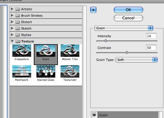
This is the basic design for the holiday sale. From here I have added a grain effect to the main circle to give it a more retro feel to match the ribbon.
To add the texture go to the "fx" button in the Appearance panel and navigate to Texture > Grain. You can see the settings I’ve used in the image below. Play around with the settings to come up with something you like.
This is the final effect. I also changed the stroke to 1pt because the grain was making the 2pt line stand out too much and re-positioned the hanger to make a nicer design.
Note: It’s best to add any raster effects when you have finished the main design as it can often slow down the computer and sometimes even freezes the application.
Step 16
I’ve also noticed that the banner and the hanger could use a drop shadow. To do this, select the top group of the banner, then go to the "fx" button in the Appearance panel and navigate to Stylize > Drop Shadow. To keep the softer tones of the design I’ve used a dark tone of the main color (in this case a dark blue) and set the Mode to Multiple, the Opacity to 40% , the offset to 3px and the blur to 3px.
To add a drop shadow to the hanger, I’ve made an ellipse, colored it a mid tone of the main color (in this case a mid gray/blue) and sent it behind the hanger (press Command + Left Square Bracket until it’s in position) With the shadow selected, go to to the "fx" button in the Appearance panel and navigate to Blur > Gaussian Blur. Set the Radius to 3.7 pixels (or anything that looks good in the preview) Click OK.
Conclusion
Experiment with different colors and letters to see what you can come up with. If you want to change the angle of the ribbon, go to Object > Expand Appearance before you move it as the warp effect will change in unexpected ways because of the position (Be sure to save a copy before you do this as you cannot edit the ribbon after expanding it). I hope you’ve enjoyed this tut.


